

Abstract
We present Peax, a novel feature-based technique for interactive visual pattern search in sequential data, like time series or data mapped to a genome sequence. Visually searching for patterns by similarity is often challenging because of the large search space, the visual complexity of patterns, and the user’s perception of similarity. For example, in genomics, researchers try to link patterns in multivariate sequential data to fundamental cellular or pathogenic processes, but a lack of ground truth and high variance makes automatic pattern detection unreliable. We have developed a convolutional autoencoder for unsupervised representation learning of regions in sequential data that can capture more visual details of complex patterns compared to existing similarity measures. Using this learned representation as features of the sequential data, our accompanying visual query system enables interactive feedback-driven adjustments of the pattern search to adapt to the users’ perceived similarity. While users label regions as either matching their search target or not, a random forest classifier learns to weigh the importance of different dimensions of the learned representation. We employ an active learning sampling strategy to focus the labeling process on regions that will improve the classifier in subsequent training. Peax is open-source, customizable, and we demonstrate its features through an extensive case study in genomics. Moreover, we report on the ability of our autoencoder models to capture visual features and evaluate the effectiveness of the learned representation for similarity search in two user studies. We show that our models retrieve significantly more similar patterns than other commonly used techniques.
1 Introduction
Visually searching for patterns in sequential data can be challenging when the search space is large, the data is complex, or the search query is difficult to formalize. Visual query systems simplify the query formalization by allowing analysts to find regions in the data given a visual description of the pattern, often in the form of a sketch [35,52,69] or an example [8]. Using the query, the system retrieves regions that are most similar given some notion of similarity. But the search can fail when the analyst’s subjectively perceived similarity does not match the system’s similarity measure [19]. The larger the query region, is the more likely it is that the query contains several distinct visual features, such as peaks, trends, or troughs, which can be hard to capture with current techniques as exemplified in Figure 2. Not knowing what visual feature is important to the user makes similarity search even more challenging.
While well-known distance metrics, like Euclidean distance (ED) and dynamic time warping (DTW), in combination with one-nearest neighbor search are traditionally used for classification of sequential data [18], Correll and Gleicher have found that “no single algorithm accounts for human judgments of time series similarity” [14]. They instead suggest to combine several metrics and let the analyst choose which one to use for pattern search. To this end, the distance measures act as a feature representation of the sequential data. Such an approach has been used before [26,27,36], as a first step to address the issue. However, it assumes that the combination of handcrafted distance metrics is able to capture many important pattern variations [14], that the analyst is aware of the visual features in the query pattern that they care about, and that the analyst knows which individual distance metric can identify or ignore the variations of interest. If the latter two do not hold, the visual query system can become inefficient and confuse the analysts rather than leading to successful exploration—known as the gulf of execution and evaluation [58]. Prior work on natural image search [23] has shown that user-provided binary feedback (i.e., interesting and not interesting) can be a powerful approach to interactively learn which visual aspects are important without introducing a complicated user interface.
To address these challenges, we propose a novel feature-based approach for assessing the similarity of visual patterns in sequential data using convolutional autoencoder models. An autoencoder is a type of neural network that learns an identity function of some data. By introducing a lower-dimensional layer during the encoding step, the neural network is forced to find a compressed latent representation of the input data that captures as many visual details of the input data as possible (Figure 1.1). We use this learned latent representation as features to compare the similarity between patterns. Since the subjectively perceived similarity of an analyst is not known upfront we have developed Peax, a visual query system that interactively learns a classifier for pattern search through binary relevance feedback (Figure 1.3). After the analyst defines a query by example, Peax samples potentially interesting regions based on the Euclidean distance in the regions’ latent space that is derived by the autoencoder models. We employ a sliding window approach with a user-defined window size and resolution to limit the search space. The analyst can label the sampled windows as either interesting or not interesting with a single mouse click. We then train a random forest classifier using these labels. After classifier training, we employ an active learning strategy (Figure 1.2) to focus the labeling process on the windows that are close to the query window, located in dense areas in the latent space, and hard to predict by the classifier. Peax supports exploration of multivariate sequential data by concatenating multiple latent representations provided by potentially different autoencoders. This enables the analyst to adjust the combination data to be explored on the fly without having to train a separate autoencoder.

Using a convolutional autoencoder (1) regions of sequential data are encoded into a compressed latent representation. Based on this encoding Peax employs an active learning strategy (2) to focus the visual exploration (3) on regions which are useful for training a classifier. This classifier is then iteratively trained on the user’s binary labels  to predict the interestingness of regions in the sequential data.
We apply our technique on two epigenomic datasets and demonstrate how Peax can be used to explore biological phenomena (section 7). In epigenomics, biomedical researchers study how the genome of an organism is regulated through various modifications of the DNA and associated proteins that do not change the underlying DNA sequence. A better understanding of epigenomic modifications is crucial as, for example, genome-wide association studies have found that over 90% of all disease-associated DNA sequence variants are located in non-coding regions [41,54,65] that are most likely acting on gene regulation. Using various biochemical methods (section 7) researchers can measure specific epigenomics properties, such as the gene expression level, protein binding sites, or DNA accessibility, which act as annotation of DNA sequence. These annotations are called tracks, and a combination of them can be regarded as multivariate sequential data. Finding epigenomic patterns is challenging [25,61] as the inter- and intra-measurement variance is high, the data is typically very noisy, and ground truth is missing in almost all cases. Furthermore, formally describing biological phenomena is often challenging due to the complexity of datasets or different interpretations of the same biological mechanism [24].
To evaluate our approach on finding visual patterns, we first assess how well the autoencoder is able to reconstruct visual features in sequential patterns and measure how the learned latent representation can be used for similarity search in two Mechanical Turk user studies. Compared to six commonly used techniques for similarity search, we find that our model is able to capture the most important visual features and subsequently retrieves patterns that are perceived significantly more similar by the participants than any other technique. To the best of our knowledge, we present the first deep-learning-based approach for interactive visual pattern search in sequential data. The source code for Peax, instructions on how our autoencoder models are trained, and a set of 6 autoencoders [44] for two types of epigenomic data are available online at https://github.com/Novartis/peax/.
2 Related Work
Similarity Measures for pattern search in sequential data have been studied extensively [72]. Techniques for similarity search include distance-based and feature-based methods. Distance-based methods provide a single value for how different patterns are compared to each other. The two most widely used distance metrics with consistently strong performance [18,68] are Euclidean distance [21] (ED) and dynamic time warping [5] (DTW). Feature-based methods use a set of features describing the data in conjunction with a distance-based method or machine learning technique for comparison and classification [10,14,27,36–38,46]. Widely-used feature-based methods include, for example, piecewise aggregate approximation [37] (PAA) and symbolic aggregate approximation [46] (SAX), which are part of a class called symbolic representations. Both methods discretize sequential data into segments of equal size and aggregate these segments into a new representation. We apply PAA (Figure 3.3) to downsample the segmented data as a preprocessing step. Other feature-based approaches combine several distance metrics [14,36] into a feature representation assuming that a combination will capture more variations. Fulcher and Jones [26,27] took this approach to an extreme and proposed a supervised feature extraction technique that represents a time series by a combination of over 9000 handcrafted metrics. Christ et al. [11] extended this approach but we find that it does not provide comparable performance in an unsupervised setting (subsection 8.2).
General purpose dimensionality reduction techniques such as t-SNE [51] or UMAP [55] can also be used to learn a lower-dimensional embedding as a feature representation. While we employ UMAP for embedding encoded regions onto a two-dimensional canvas for visualization purposes, we show that this embedding alone is not a suitable basis for visual pattern search (Figure 8). Finally, autoencoder [4] (AE) models provide a data-driven approach to learn a feature presentation. It was shown that AEs can extract a hierarchy of features from natural images [53], textual data like electronic health records [56], or scatter plot visualizations [50]. AEs have also been applied on time series data for classification [22] and predictions [30,49,62]. In this paper, we extend these works and leverage AEs to learn feature representations for interactive similarity search in sequential data.
Visual Query Systems (VQS) can be divided into two general approaches that let the user query for patterns by example or by sketching. Time-Searcher [32, 33] is an early instance of a query-by-example system that supports value-based filtering and similarity search [8] using rectangular boxes drawn on top of a time series visualization. QueryLines [64] is a sketch-based filtering technique for defining strict or fuzzy value limits based on multiple straight lines. Time series that conflict with a limit are either filtered or de-emphasized visually. QuerySketch [69] is one of the first systems that supports similarity search by sketching. The user can directly draw onto the visualized time series to find similar instances using the ED. Holz and Feiner [35] combined the ideas of QuerySketch and QueryLines and developed a tolerance-aware sketch-based system. Their technique measures shape and time deviation during sketching to determine which parts of the sketched query should be relaxed. Recently, Mannino and Abouzied presented Qetch [52] for querying time series data based on scale-free hand-drawn sketches. Qetch ignores global scaling differences and instead determines the best hit according to local scale and shape distortions. However, Lee et al. [42] find that sketch-based systems are rarely used in real-world situations as users are often unable to articulate precisely what they are looking for and, therefore, have a hard time sketching the correct query. Peax does not use a sketch-based strategy as it is hard to imagine that users are able to accurately draw complex patterns as shown in Figure 2.

Given search query in blue, we see all six methods on the left fail to capture many salient peaks (issues are marked with a pink dot). While our autoencoder-base technique (CAE) also misses the small left-most peak it finds more similar instances.
Apart from the query interface, Keogh and Pazzani [38,39] show that the notion of similarity can heavily depend on the user’s mental model and might not be captured well with an objective similarity measure. Eichmann and Zgraggen [19] extend this line of work and show that the objective similarity can differ markedly from the perceived similarity, even for simple patterns. Corell and Gleicher [14] build upon these findings and define a set of ten invariants, i.e., visual variations or distortions that a user might want to ignore during pattern search. They evaluate three distance measures and find that “no single algorithm accounts for human judgments of time series similarity” [14]. This indicates that it might be impossible to develop a single distance metric that captures all perceived notions of similarity.
Active Learning is a powerful technique to adjust the results of a VQS through simple user interactions. For example, Keogh and Pazzani [38,39] propose relevance-feedback driven query adjustments for time series. Given a query, their system asks the user to rank the three nearest neighbors. The ranking is then used to change the query using a weighted average of the original query and the ranked nearest neighbors. Similar approaches have been studied by Behrisch et al. [3] on scatter plots. In their system, a user interactively trains a decision tree classifier based on the user’s feedback to learn to capture the interestingness of scatter plot views. CueFlik [23] is a tool for interactive concept learning in image search, which allows the user to rank the results of a text-based image search using binary feedback. The labels are subsequently used to find optimal weights for low-level image features [17] such that the distance between images labeled as good matches is small and the distance to images labeled as bad matches is high. CueFlik employs an active learning strategy to find images that potentially help to separate interesting from non-interesting images. We use a two-step active learning strategy that incorporates a distance-dependent term (section 5) in addition to uncertainty sampling to ensure that more similar regions are labeled before the exploration space is broadened.
3 Goals and Tasks
The primary goal of Peax is to find regions in sequential data that show an instance of the target pattern. The target pattern can either be defined manually as a query by example or by a set of already existing labels derived elsewhere. In both cases, the user might either be interested in finding the k most similar matches or in retrieving all windows that exhibit a pattern matching the target. The main difference between the two goals is whether recall is negligible (first case) or essential (second case). To achieve either goal, the user needs to know which windows are classified as interesting by the trained classifier, i.e., are assumed to show an instance of the target pattern. Therefore, it is crucial that the user understands what concept the trained classifier has learned. Since the classifier is interactively trained based on the user’s subjective labels, there is no objective metric for when to stop the training process. Thus, the user needs to be aware of the training progress to make an informed decision about when to stop training. The user may also inspect the encoding performance of the classifier by looking at the latent representation.
As shown in Figure 3, the user might either start with a manual query by example or a set of already labeled data. To arrive at a set of matching windows the user has to label several patterns in order to provide training data to the classifier and steer the learning process. We identified four main avenues for training the classifier. First, users need to be able to explore unlabeled windows according to a sampling strategy that chooses windows intelligently such that the classifier’s prediction uncertainty is reduced. It also needs to be possible to manually select windows from the original dataset for labeling. Once a classifier is trained, the user needs to be allowed to provide immediate feedback on the results to foster or adjust what the classifier assumes to be interesting. Finally, re-examining and potentially re-labeling windows is important to resolve conflicts between the user’s labels and the predicted classes. We assume that the first two labeling strategies are more common when building a classifier from scratch. The latter two strategies seem more relevant when starting with already labeled data.

A user can either start a new search via a query by example or with already labeled data with the goal of finding the k best matches or retrieving all matches. To arrive at the goal the user needs to provide and adjust labels to steer the learning process of a classifier through several iterations.
Following these goals and this workflow (Figure 3), we have identified a set of high-level interaction tasks that underlie the design of Peax (subsection 6.1):
T1: Freely browse and explore to be able to gain an overview of the data and to find search queries.
T2: Identify the classifier’s predictions to be able to understand what the currently matching pattern is.
T3: Compare windows to identify similarities or dissimilarities among potentially related windows.
T4: Contextualize windows to understand the broader impact of a pattern, to improve confidence of the manually assigned labels, and to find related windows.
T5: Visualize the learning progress to highlight the impact of labeling and inform about the status of the trained classifier.
T6: Show the capabilities of the latent representation to realize if the visual features of the query pattern were captured.
4 Representation Learning
Instead of relying on handcrafted feature descriptors that do not capture complex patterns well (Figure 8), we learn the feature representation from the sequential data in an unsupervised fashion using a convolutional autoencoder (CAE) model. To limit the search space and improve learnability, we employ a sliding window approach that divides the data into overlapping windows of fixed size and resolution as shown in Figure 4.1.
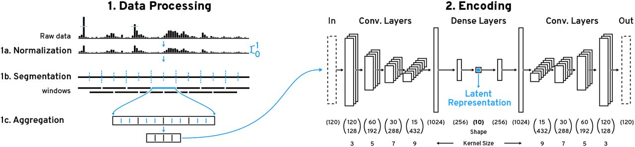
(1) We employ a sliding window approach for pattern search on normalized (1a) piecewise (1b) aggregated (1c) windows. (2) These windows are then encoded with our convolutional autoencoder (CAE) to obtain the latent representation. The CAE consists of a 4-layer convolutional encoder with an increasing number of filters and kernel size followed by two dense layers. The central layer outputs the 10-dimensional latent representation.
4.1 Data Preprocessing
We cap values at the 99.9th percentile to remove rare outliers and then scale the data to a value range of [0,1]. After this normalization, we split the data into overlapping windows w of fixed length l. The overlap is controlled by the step size s and step frequency f, where  . The step frequency f can also be adjusted during the search process but the window length l is fixed. Therefore, l is critical as the CAE will only be able to recognize co-located patterns that appear within the window. Ideally one would want to use the highest possible l to capture more context but in practice the level of detail that the CAE can capture decreases with larger l (Figure 7).
Next, we downsample each window by a factor of r, such that each resulting bin represents an average over r values. Downsampling has been shown to be an effective similarity search strategy on its own [37]. Also, this allows the CAE to learn on data that looks similar to what a user would see when visualizing the data on a common computer screen. Finally, depending on the type of sequential data it might be necessary to filter out windows that contain very little to no visual features or that are highly overrepresented (section 7).
4.2 Convolutional Autoencoder
The preprocessed windows are used to train a CAE. The CAE consists of an encoder and a decoder model, where the encoder is trying to learn a transformation of the input data that the decoder is able to reconstruct into the original input as best as possible. In other words, the goal of the CAE is to learn an identity mapping of the preprocessed windows. Having the encoder output a vector that has fewer dimensions than the input forces the encoder to compress redundant information and to effectively learn features that are useful for reconstruction.
Our CAE’s encoder model (Figure 4.2) consists of four convolutional layers followed by two fully connected layers. The four convolutional layers have 128, 192, 288, and 432 filters with kernel sizes of 3, 5, 7, and 9 respectively. Following Springenberg et al.’s approach [67] we use a striding of 2 instead of max pooling to shrink the convolved output per layer. Such architectures have previously been shown to enable hierarchical feature learning [53]. While the kernel size is typically unchanged in models for natural images, we found that larger kernel sizes lower the reconstruction error for sequential data (Supplementary Table S5). We believe that larger kernels enable the CAE to incorporate more context, which we assume helps to capture co-located visual features, e.g., double peaks. The two fully-connected layers consist of 1024 and 256 units. The final layer consists of 10 units and outputs the latent representation. All layers use the ReLu activation function. The CAE’s decoder model consists of the same layers just in reverse order and features an additional final layer with a sigmoid activation function to ensure that the output is within [0,1].
5 Active Learning
Peax employs two sampling strategies to select unlabeled windows and that are subsequently shown to the analysts for labeling. The first sampling strategy is only used upon starting a new search when no classifier has been trained yet. In this case classifier-related metrics such as uncertainty are unknown and the strategy only relies on the pairwise density of windows and their distance to the query window. The density of a window w is defined as the sum of mutual distances of the k nearest neighbors of all windows W in the autoencoded latent space:

In this equation, nn is a function returning the kth nearest neighbour and norm scales the input to [0,1]. The parameter k (default: 5) controls the size of the neighborhood. Having sorted all unlabeled windows by their distance to the query, we select l × m = n windows with increasing distance to the query (defaults for l and m: 5). I.e., the first set of m windows is sampled from the r (default: 10) closest windows, the second set of m windows is sampled from the rth to the r * 21th closest windows, the third set of m windows is sampled from the r * 21th to the r * 22th closest windows, etc. In each set b, the m windows are sampled iteratively such that the window with the highest density that is farthest away from already chosen samples S is selected. Formally, this means that the unlabeled window ub from set b with the lowest following score is selected:

The goal of the initial sampling strategy is to gradually increase the search radii such that positive and negative windows are selected. This is important because we need both types during initial training otherwise the initial classifier could be highly biased towards negative or positive windows. Also, we include a density-dependent term to avoid sampling outliers and we maximize the pairwise distance between sampled windows to let the user annotate a variety of samples. For the active learning sampling strategy, we extend the knn density properties and the pairwise distance maximization with distance-to-query and uncertainty terms. The distance-to-query is the same as in the initial sampling strategy but used directly for selecting the samples. We then use uncertainty sampling [66] as defined in the following equation, where pw stands for the classifier’s prediction probability of a window w:

Finally, the active learning sampling strategy iteratively selects na (default: 10) unlabeled windows. Here the ith samples is determined as the unlabeled window u with the lowest score as follows, where S stands for the already sampled windows:

Thus, uncertain windows that are within dense neighborhoods of the latent space reduce the overall uncertainty of the classifier after the next training. The distance dependent term is added to focus the sampling strategy on the query’s neighborhood first as this neighborhood contains highly similar windows (subsection 8.2). We assume that at the beginning of the active learning process it is beneficial to focus on regions that show closely-related variations of the query pattern before broadening the exploration.
5.1 Classifier
Given the small number of labels when training a new classifier from scratch and the repeatedly online training during the search, we choose to use a random forest classifier. This allows for efficient re-training each time the labels have changed or after requesting a new set of unlabeled windows based on the active learning sampling strategy. Ultimately, we use the predicted classes to define the resulting set of matching windows.
5.2 Training Progress
To measure the classification process, we record overall uncertainty, the total change in prediction probability, and the divergence of prediction probabilities. The overall uncertainty is defined as the arithmetic mean of the class prediction uncertainty (Equation 3). The classifier’s uncertainty can indicate if the classifier learned to reliably detect a certain pattern type and if any progress is made over several iterations. The prediction probability change, which is defined as the arithmetic mean of the difference between the per-window prediction probability of the current and previous classifier, can provide insights about the impact of a training iteration. Finally, convergence is determined as the overall number of windows for which the prediction probability consecutively decreases or increases over the last 3 classifiers. All non-converging windows are considered diverging if the change in the prediction probability is larger than 0.01. The convergence and divergence rate can inform the user about the overall stability of the classifier. Formal definitions for all three progress metrics are provided in Supplementary Table S1.
6 The System
Based on the identified tasks (T1)–(T6) (section 3), we have developed Peax to provide a visual interface for feedback-driven interactive visual pattern search and exploration of sequential data.
6.1 Interface Design
The user interface consists of four main components shown in Figure 5.

The interface of Peax consists of four main views: the (1) query, (2) list, (3) embedding, and (4) progress view. The pan-&-zoomable query view visualizes the data as blue bars that can superimpose the CAE’s reconstruction as pink bars on demand (2). Besides optional metadata tracks (1a),Peax draws region-based annotations at the top to indicate the prediction probability (1b), manual labels (1c), and custom window selections (1d). The list view (2) shows windows of sequential data for comparison and labeling. Aside is the embedding view (3) that shows windows as dots projected into a 2D canvas. By default blue dots stand for positive labels, pink stands for negative labels, gray represents no label, and black indicates the query. The progress view (4) visualizes metrics about the iteratively trained classifier as composed bar charts (4) where the dark (4a) and light (4b) bars indicate the progress in terms of the labeled and all windows respectively.
Query View
The system shows the selected search query or the highest ranked window by default in the query view (Figure 1) to provide content to the targeted pattern search (T4). This view is not static but allows the user to interactively browse the entire dataset (T1) for contextualization (Figure 5.1). The user can also choose to visualize additional metadata (Figure 5.1a) such as gene annotations to add further context (T4) during exploration. Additionally, after having trained a classifier for the first time, the view features a onedimensional heatmap track (Figure 5.1b) that color-encodes the prediction probability for regions in the data (T2). The main focus during navigation is on positive hits and we use a max-binning approach to show positively classified regions even when the user is zoomed out to view an entire chromosome (Figure 5.1a). In addition to the prediction probability, the query view shows two more types of region-based annotations: blue and pink rectangles indicate positive and negative labels (Figure 5.1c) that were defined by the user and yellow highlights selected windows (Figure 5.1d). Finally, the sequential data track can be superimposed with the reconstruction of the CAE model (Figure 1 and Figure 5.2) to enable the user to understand which visual features were actually learned (T6). This can also be used for debugging the latent space when a pattern search fails.
List View
The list view (Figure 5.2) visualizes several independent windows for labeling and comparison (T3). These windows are listed vertically and are aligned to the query view for efficient visual comparisons (Figure 1). Each window has three buttons (Figure 5.2f) to label a window as interesting  , not interesting
  , or inconclusive
  . Additionally, two buttons on the left side of each window (Figure 5.2d) allow the user to select a window
  for separate comparison and to re-scale
  all currently visible windows to the associated window such that the y-scales of all windows are the same for value-based comparison (T3). By default, each window and the query view are individually scaled to the minimum and maximum value of the visible data to highlight the pattern shapes. The list view consists of three permanent and one temporary set of windows that are organized under different tabs (Figure 5.2a). The new samples tab on the left is selected upon starting a new search and contains unlabeled windows that are sampled by the active learning strategy (section 5). The results tab in the middle, which is selected by default after having trained a classifier (Figure 5.2), lists the windows that are predicted by the classifier to match the query. The labels tab on the right holds the set of already labeled windows. Additionally, when the user selects some windows a fourth tab is shown to the right of the labels tab allowing the user to compare the selected windows (T3). Finally, the results tab includes two important features to improve recall and debug data. First, it allows to dynamically adjust the probability threshold at which a window is considered positive by the classifier (Figure 5.2b). And in case the classifier and the user’s labels disagree, a pink button appears (Figure 5.2e) to inform the user about the potential conflicts.
Embedding View
To provide an overview of the entire set of windows and allow the user to contextualize (T4) windows by their similarity in the latent space, Peax provides a view of the 2D-embedded windows (Figure 5.3). The embedding is realized with UMAP [55] and takes into account the window’s latent representation as well as the user’s labels. Windows are represented as points that are either color-encoded by their label (Figure 5.3a) or by their prediction probability (Figure 5.3b). The view supports pan and zoom interaction as well as dynamic selection via a mouse click on a dot or a lasso selection that is activated by holding down the shift key and the left mouse button while dragging over points (Figure 5.3c). Selecting windows is important for comparing (T3) local neighborhoods during exploration and for debugging already labeled windows.
Progress View
To inform the user of the training progress and provide guidance on when to stop the training (T5), we visualize metrics for the uncertainty and stability (Figure 5.4) as defined in subsection 5.2. Each metric is applied separately to the entire set of windows and to the labeled windows. Visually this information is encoded as superimposed bars where the smaller but more saturated bar (Figure 5.4a) represents the metric in regards to the labeled windows and the wider bar represents all windows (Figure 5.4b). The y-scale is normalized to [0,1] and the x-scale stands for the number of labeled windows that were used to train a classifier. The diverging bar plot for the convergence metric simultaneously visualizes the convergence score in the upper part and the divergence score in the lower part. In general, as the training progresses one would expect each score to decrease. Large bars either indicate that the classifier is still uncertain or unstable. It is also possible that the target pattern changed or that the latent representation is not able to properly represent the features of the query.
View Linking
The query, list, and embedding view are highly interlinked to foster contextualization (T4) and comparison (T3) of windows. For instance, moving the mouse over a window in the list view (Figure 5.2c) highlights the same location in the query view (Figure 5.1e) and the corresponding point in the embedding view (Figure 5.3d). The highlighted position of a window in the embedding view informs the user how windows compare to each other in terms of their latent representations and the shared mouse location highlights the windows’ spatial locality in terms of the underlying sequence.
6.2 Implementation
Peax consists of three parts, which are reflected in a highly modular code base. The frontend application is implemented in JavaScript and uses React [20] as its application framework. The bar chart tracks are visualized with HiGlass [40]. The embedding view uses Regl [48] for WebGL rendering and is published as a separate software package [43]. The backend application that serves data to HiGlass and handles the active learning aspects is written in Python and uses Flask [63] as its web application framework. The trained classifiers and search results are persistently stored in a Sqlite [31] database. Prior to learning a classifier, the user has to configure the data sources and encoders using a simple JSON configuration file. For training the CAEs we use Keras [9] with TensorFlow [1]. Documentation on how we trained our autoencoders is provided in the form of iPython Notebooks [60]. Finally, we use Scikit-Learn’s random forest classifier [59] as the classifier for active learning. All of the source code, as well as detailed instructions on how to get started with Peax, are available at https://github.com/Novartis/peax/.
7 Use Cases: Epigenomics
The human genome is a sequence of roughly 3.3 billion chemical units, called base pairs (bp), which together encode for protein and RNA genes, the building blocks that define cells. This coding information accounts for less than 2% of the human genome, while the remaining fraction contains the regulatory information for when and where each gene is expressed. The vast majority of cells contain the same coding DNA information, thus variation in the state of regulatory DNA is largely responsible for the full diversity of our tens of trillions of cells [13]. Gene expression is mechanistically regulated by interacting networks of specialized genomic regions called enhancers and promoters [57] and associated protein complexes, collectively called chromatin. Increases and decreases in gene expression are controlled not by modification of the DNA sequence itself in these regions, but instead by modification of the degree of compaction of DNA (i.e. “accessibility”), as well as modification of the core chromatin proteins called histones. This set of modifications is collectively labeled the “epigenome”. Studying the epigenome involves, for example, the genome-wide measurement of DNA accessibility (e.g., DNase-seq [15], FAIRE-seq [28], or ATAC-seq [7]), DNA protein binding and histone modifications (e.g., ChIP-seq [2]), gene expression (e.g., RNA-seq [47]), and spatial chromatin conformation (e.g., Hi-C [45]). Consortia like ENCODE [12], Roadmap Epigenomics [6], or 4D Nucleome [16] generate and provide a large collection of these assays across many different cell types and tissues. But even though strict protocols and processing pipelines are applied, the variance between measurements and biological samples remains high and detecting regulatory elements is still highly challenging [25,61].
Bioinformaticians have developed many algorithms to identify causal relationships between experimental conditions and to infer the function of genomic regions. As the driving use case for our visual pattern search approach, we focus on the exploration of regulatory elements [57], which are regions on the genome that can directly influence the activity of gene expression or other regulatory elements. DNA accessibility and specific histone modifications are often used as proxies for detecting these regulatory elements. Peaks (Figure 6) highlight the strength of epigenomic marks and multiple epigenomic data types (accessibility and various histone modifications) are typically explored in parallel, as multivariate sequential data, since no single method provides enough evidence to confirm the presence of some regulatory function.

(1) and (2) show the results for building a building an asymmetrical peak detector from scratch. After several iterations (2) the classifier stabilized and we see (1) the top results for several asymmetric peaks that are typically associated with promoter regions as confirmed by the presence of gene annotations (*). In (3) we refined existing labels to build a differential peak detector (3a) after resolving an initially high uncertainty in the existing labels (3b & c).
To explore this type of data we trained six CAEs [44] for 100 epochs on 343 histone ChIP-seq datasets (modifications H3K4me1, H3K4me3, H3K27ac, H3K9ac, H3K27me3, H3K9me3, and H3K36me3 across multiple conditions) and 120 DNaseI hypersensitivity datasets (DNase-seq), at 3 kilobase pairs (kb), 12 kb, and 120 kb, with bin sizes of 25, 100, and 1000 bp respectively. See Supplementary Tables S3–S5 for details.
7.1 Finding Peaks
We demonstrate how Peax can be used to find regulatory regions in epigenomic data. In recent work exploiting epigenomic data to detect regulatory enhancer patterns, Fu et al. [25] found that DNase-seq and histone mark ChIP-seq peak callers retrieve and rank peak patterns very differently and that the overall accuracy for finding regulatory elements is still quite low. Inspired by their findings, we first show how Peax can be used to build a classifier for a symmetrically and asymmetrically co-occurring peak patterns from scratch using DNase-seq and H3K27ac ChIP-seq data. We then illustrate how existing peak annotations can be used as a starting point to find patterns of differentially activated regulatory regions. We begin by defining the view composition and encoder models. We choose a lung DNase-seq and H3K27ac histone mark ChIP-seq dataset from ENCODE an encode it with our 3 kb DNase-seq and ChIP-seq CAEs. For general orientation we added two non-encodable metadata tracks for chromosome positions and gene annotations. Peax can handle many kinds of view setups as long as there is at least one encodable track.
Building a Classifier From Scratch
Having defined our view, Peax presents a freely browsable epigenome view in which we search for an example to query by (Figure 6.1a). To train a classifier from scratch we follow the left side of our workflow (Figure 3) and make use of the active learning strategy (section 5) to initially label a set of 65 windows. The progress view (Figure 6.2) shows that the uncertainty first increases (Figure 6.2a) and then gradually decreases (Figure 6.2b), indicating that the classifier is learning to detect a certain pattern type. To get a better idea of the overall landscape of windows, we compute the 2D embedding, which shows several clusters (Figure 6.3a). To determine if the classifier is able to detect our pattern type, we take a look at the results. After excluding our own positive labels, we see that the classifier is finding similar patterns. To further improve the predictions, we go through the results and label another 37 positive hits and remove false positive hits. We remain in the results view and assess the recall of our current classifier. To do so we first change the ordering such that windows with the lowest class prediction probability are listed first. We find that windows with a lower class probability still match our pattern and adjust the prediction probability threshold to 0.35. The system warns us about potential conflicts that highlight a false negative and false positive window given our labels. Finally, to improve our classifier, we manually identify neighborhoods of windows showing instances of our query pattern using the embedding view (Figure 6.3). We realize that all of our labeled windows come from one specific area (Figure 6.3a). Not surprisingly, after switching to the prediction probability color encoding, we find that our classifier is predicting only one neighborhood to be of interest to us (Figure 6.3b). After zooming in (Figure 6.3c), we use the embedding view’s lasso tool to explore windows in a local neighborhood (Figure 6.3d) to further improve the classification (Figure 6.3e). (See (Supplementary Figure S18-S29 for details.)
Refine Existing Labels to Build an Improved Classifier
As an alternative to building a classifier from scratch, Peax enables interactive refinement to improve the quality of existing labels. This time we try to find differentially accessible peaks between 2 DNase-seq datasets, which are shown [25] to be highly predictive of tissue-specific regulatory elements, in this case between embryonic face and hindbrain. Using algorithmically-derived peak annotations, we define positive labels as regions that have a reported peak annotation in one dataset but not in the other and negative labels as regions that share peak annotations.
After loading Peax, we first train a classifier given our pre-loaded labels.
Since we have not specified a query region, Peax shows the region with the highest prediction probability in the query view. We start exploring the results and find that the top results indeed show a pronounced peak in one track and no peak in the other. Given the surprisingly high number of positively-classified windows, we investigate the prediction probability landscape in the embedding view and see that almost every window has a prediction probability higher than 0.5 (Figure 6.3c). We reorder the results to see if windows close to the probability threshold contain differential peaks. Since most of them do not, we adjust the probability threshold to 0.85 to be above the average prediction probability of 0.8. We identify 24 potential conflicts and find that most windows highlighted as false negative are incorrectly labeled. This shows that the pre-loaded peak annotations are far from perfect. We resolve several issues and retrain the classifier. We observe a strong and expected change in the average prediction probability and we notice that the uncertainty of our classifier for labeled windows decreased while the uncertainty for unlabeled data increased (Figure 6.3f). The embedding view shows a large group of windows with high uncertainty (Figure 6.3d). Using the embedding view, we quickly investigate local neighborhoods in uncertain regions. By assigning correct labels to some windows in those regions we are able to reduce the uncertainty of many windows notably (Figure 6.3e). After verifying that our classifier indeed detects differential peaks (Figure 6.3a), we explore the entire dataset using the heatmap of predictions to review their spatial location (Figure 6.3g). (See (Supplementary Figure S30–S44 for details.)
8 Evaluation
Using the data from our use case (section 7), we first assessed the ability of the CAE to reconstruct windows of sequential data and then compared the effectiveness of our latent representation for visual similarity to six other widely-used techniques.
8.1 Reconstruction
We study the reconstruction to assess the general training performance of our CAE model for learning to encode visual features into the compressed latent representation. While the reconstruction is not expected to be perfect given the 12-fold compression, it should capture the main visual properties to be useful for visual similarity search.
Figure 7 exemplifies the reconstruction quality of the six CAEs from our use case (section 7). More example reconstructions are available in Supplementary Figure S1–6. It appears that the model is able to learn the visual properties of the epigenomic datasets. Most of the salient peaks are captured by the CAEs in general. As the window size and resolution increase from 3 kb over 12 kb to 120 kb (with a binning of 25 bp, 100 bp, and 1000 bp) the reconstruction quality decreases. Hence, the model is not able to encode high frequent variations. Numerically this is captured by an increase in the reconstruction loss for larger window sizes. Since absolute loss is hard to interpret we report R2 scores, which tell us how much variability is captured by the reconstruction, where a score of 1 stands for a perfect reconstruction. All reported scores are computed on the test data. For the CAEs trained on DNase-seq data the R2 is .98, .90, and .78 for 3 kb, 12 kb, and 120 kb windows respectively. Similarly, the R2 scores for the CAE trained on histone mark ChIP-seq data are .84, .69, and .73 for 3 kb, 12 kb, and 120 kb windows respectively.

We show 3 example reconstructions per data type (DNase-seq and ChIP-seq) per window size (3 kb, 12 kb, and 120 kb). The black bars represent the input and the blue bars visualize the reconstruction. The third charts show the differences where blue indicates missing data in and pink indicates over-estimation of the reconstruction. As the window size increases the reconstruction gets less accurate. Since DNase-seq data contains less frequent peaks the reconstruction is more accurate.
8.2 Similarity Comparison
Knowing that the CAEs are able to successfully reconstruct most of the visual features, we wanted to know whether the learned representation is more effective for visual similarity search in terms of the perceived similarity by users than existing techniques. Given a DNase-seq dataset from our use case we manually identified 9 diverse query patterns for each window size. Using a k-nearest neighbor search strategy with k = 5, we subsequently retrieved the 5 windows that are closest to each of the queries using the latent representation of our CAEs and six other techniques (Supplementary Table S6). ED [21], SAX [46], DTW [5], and zero-normalized cross-correlation (XCORR) are four distance-methods we compare against. Additionally, we included UMAP [55] and TSFRESH [10] as two promising feature-based techniques. Figure 8 shows the nine queries for 12 kb windows together with the five nearest neighbors of every method. Subjectively, the results from our model consistently find more similar patterns on average. While simple pattern, like Figure 8.4, are well captured by several techniques, every other method has at least one instance where the five nearest neighbors are missing important visual features compared to our CAE (Figure 8.i). Supplementary Figure S13 and Supplementary Figure S14 show the comparison for 3 kb and 120 kb windows.
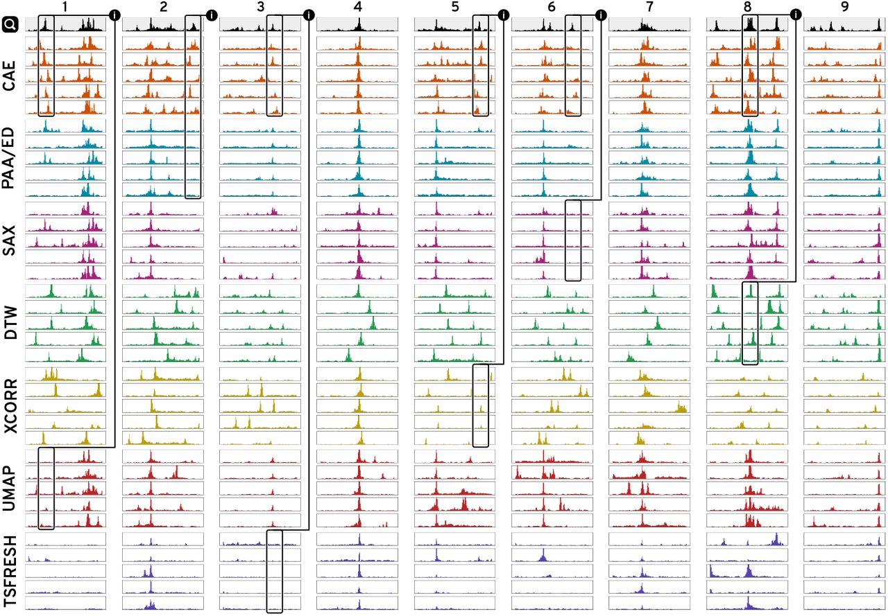
Given a query  we are showing the 5 most nearest neighbors found by our model (CAE), four distance-based methods (PAA/ED, SAX, DTW, and zero-normalized cross-correlation (XCORR)), and two feature-based methods (UMAP and TSFRESH). CAE consistently finds more similar patterns compared to all other methods except for simple query patterns (4) where many methods are equally good. All techniques are able to detect the most distinct visual feature but many fail to match secondary features, as highlighted with (i).
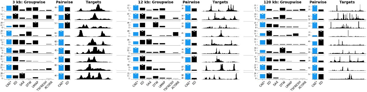
To determine whether our subjective findings hold true in general, we evaluated the similarity in an online user study on Amazon Mechanical Turk. For each of the 27 patterns (9 patterns times 3 window sizes), we generated an image showing the 5-nearest neighbors for each technique together with the query pattern. We asked the participants to “select the group of patterns that on average looks most similar and second most similar to the target pattern”. The target was drawn in black above each group of patterns that were drawn in blue (Supplementary Figure S15). The order of target patterns and 5-nearest neighbor results per technique were fixed but we randomized the order in which techniques were shown. We asked for the most and second most similar group as a pilot study revealed that the task can be hard when there are two or more groups with similarly good results. We decided against more complicated tasks such as ranking the groups by similarity to avoid fatigue. In total, a participant had to make 18 choices by comparing 7 times 9 groups of patterns. We paid participants $1 for an estimated workload of 6 minutes. Participation was restricted to master workers with a HIT approval rate higher than 97% and at least 1000 approved finished HITs. In total, we collected 75 responses. We hypothesize (H1) that our CAEs outperform other techniques by finding more similar patterns on average.
In the following, we indicate significant results with a p-value in [0.05 – 0.001] with * and results with a p-value below 0.001 with **. Using a Pearson’s chi-squared test, we find that the results for three window sizes differ significantly (**). In a post-hoc analysis using Holm-Bonferroni-corrected [34] pairwise Pearson’s chi-squared tests between our and the other six methods we find that our CAEs retrieves significantly (**) more often patterns that are perceived most or second most similar to the target compared to any other method except ED. In comparison to ED, our model only finds significantly more similar (*) patterns for 120 kb window sizes and we find no differences for 3 kb and 12 kb window sizes. The absolute results are shown in Figure 9.
Results for the subjective similarity comparison are shown as votes per technique per target pattern per pattern size. More votes mean that participants regarded the results to be visually more similar to the target. The highest votes are indicated by a dot. Results for our method (CAE) are drawn in blue.
Therefore, H1 does not hold true given the strong performance of ED. In general, we found that for simple patterns it is more likely that any method performs well. For example, in Figure 8.4 essentially every technique is able to find patterns that look very similar.
Despite the strong performance of our CAEs in general, we are surprised by some results where ED outperformed our model, e.g., Figure 8.8. We hypothesize that for complex and noisy patterns groupwise comparison can be a challenging task, especially when comparing several different groups at the same time. To gain a more detailed picture, we conducted a follow-up study on pairwise visual similarity search between the 5-nearest neighbors of just our model and ED. For each of the 27 patterns, we generated images showing the target pattern together with one pattern found with CAE and one found with ED. The pairing of patterns is determined by the order in which they were found, e.g., the first nearest neighbor from our model is paired with the first nearest neighbor from ED, etc. The order in which the patterns are drawn was randomized but the order of targets was fixed as in study one. See Supplementary Figure S16 for an example. We asked the participants to “select the pattern that looks more similar to the target” for each of the 5 nearest neighbor pairs. This resulted in a total of 45 comparisons (9 patterns × 5 pairs). We paid participants $1 for an estimated workload of 6 minutes. Participation was limited to the same population is in the first user study and we collected 75 responses again. We hypothesize (H2) that our CAE model outperforms ED in pairwise comparisons on average. At the same time, we expect to see mixed results for simple patterns. Using the same analysis from the first user study, we found that across all 5 nearest neighbors our model finds significantly (**) more similar patterns compared to ED across all window sizes. Therefore, we can accept H2. Figure 9 shows the absolute votes aggregated across all 5 nearest neighbors (see Supplementary Figure S17 for separate votes by all 5 nearest neighbor pairs).
9 Discussion
Instead of using deep learning techniques to predict the presence of a specific pattern type in a fixed combination of datasets, we use deep learning to augment human intelligence to search for patterns in multivariate sequential data. Our approach improves the performance of visual pattern search by providing a learned latent representation together with an actively-learned classifier. Having a tool for general exploration of large sequential datasets by pattern similarity complements efforts in developing highly specialized pattern detectors to ask new questions and find previously undetectable patterns.
Peax is not limited to any of the specific autoencoders that we presented in this paper. In fact, the system is explicitly designed to facilitate extension with custom encoders, and we hope that analysts will use Peax as a tool to evaluate their own (auto)encoders for pattern search. Moreover, while the use case presented in this paper is primarily focused on epigenomic datasets, the ideas apply equally to other sequential or time series data, given that the autoencoder is purely data-driven and does not require any prior knowledge. While we found that the reconstruction is not perfect, it is hard to tell what a “perfect” reconstruction in regards to visual pattern search might be. For example, it could be beneficial that the autoencoder smooths high frequency noise, as the noise is often independent of the underlying phenomena that the user is searching for. While there are legitimate reasons to assess the randomness of sequential data, like in anomaly detection, systems supporting such use cases should probably not be steered visually by humans as judging randomness is a hard task [70,71]. Finally, we would like to note that the choice of the similarity search metric should depend on the data type and the search goals. The larger the data, the more likely it is that different instances of the same pattern type exist. If the goal is to just find a single or the top k hits than many different techniques most likely give equally good results as judged by the human eye. If, on the other hand, we seek all pattern instances, or the data are highly variable, or the search goals can differ, then we propose that a feature based approach is more effective as shown by our evaluations and similarity comparisons.
10 Conclusion and Future Work
We have presented Peax, a novel technique and tool for interactive visual pattern search in sequential data. Peax allows users to actively learn a custom pattern classifier based on binary feedback for retrieving complex multivariate patterns. In two user studies and an extensive use case on epigenomic data we show that our convolutional autoencoder model learns a latent representation that is more effective at finding similar patterns.
There are many areas for future work in regards to representation learning. We want to compare the performance of different autoencoders such as different variational autoencoders, recurrent autoencoders, and other deep learning approaches such as generative adversarial networks. Especially the latter would allow visual judging of the encodings to improve debugging and sensemaking. In addition to the encoding efforts, there are several avenues to extend the active learning strategy. For example, when training a classifier from an existing set of peak annotations, a deep-learning-based strategy similar to Gonda et al. [29] might prove to be superior. In the future, we will also look at how autoencoders trained on different window sizes can be combined to support multiscale pattern search. This will require a simple user interface for providing feedback that is meaningful across different scales. We expect that Peax will simplify pattern-based exploration of sequential data and hope that it will inspire the development of new types of encoders.
Acknowledgement
We would like to thank Mark Borowsky for his ideas and support throughout the project. This work was supported in part by Novartis Institutes for BioMedical Research and the National Institutes of Health (U01 CA200059 and R00 HG007583).
References
- [1].↵
- [2].↵
- [3].↵
- [4].↵
- [5].↵
- [6].↵
- [7].↵
- [8].↵
- [9].↵
- [10].↵
- [11].↵
- [12].↵
- [13].↵
- [14].↵
- [15].↵
- [16].↵
- [17].↵
- [18].↵
- [19].↵
- [20].↵
- [21].↵
- [22].↵
- [23].↵
- [24].↵
- [25].↵
- [26].↵
- [27].↵
- [28].↵
- [29].↵
- [30].↵
- [31].↵
- [32].↵
- [33].↵
- [34].↵
- [35].↵
- [36].↵
- [37].↵
- [38].↵
- [39].↵
- [40].↵
- [41].↵
- [42].↵
- [43].↵
- [44].↵
- [45].↵
- [46].↵
- [47].↵
- [48].↵
- [49].↵
- [50].↵
- [51].↵
- [52].↵
- [53].↵
- [54].↵
- [55].↵
- [56].↵
- [57].↵
- [58].↵
- [59].↵
- [60].↵
- [61].↵
- [62].↵
- [63].↵
- [64].↵
- [65].↵
- [66].↵
- [67].↵
- [68].↵
- [69].↵
- [70].↵
- [71].↵
- [72].↵


